Luxury Garden Rooms of the Highest Standard
The Green Room Co. roots lie in bespoke joinery & internal fit out’s. Working with some of the most prestigious companies in the country, their high level skills & attention to detail set them apart from their competitors in the garden building & bespoke joinery market.
Keeping their core principles of insightful design, quality sustainable materials, craftsmanship & professionalism, the results are truly stunning garden rooms. All garden rooms & manufactured in their own joinery shop by their team of craftsmen.

Project Overview
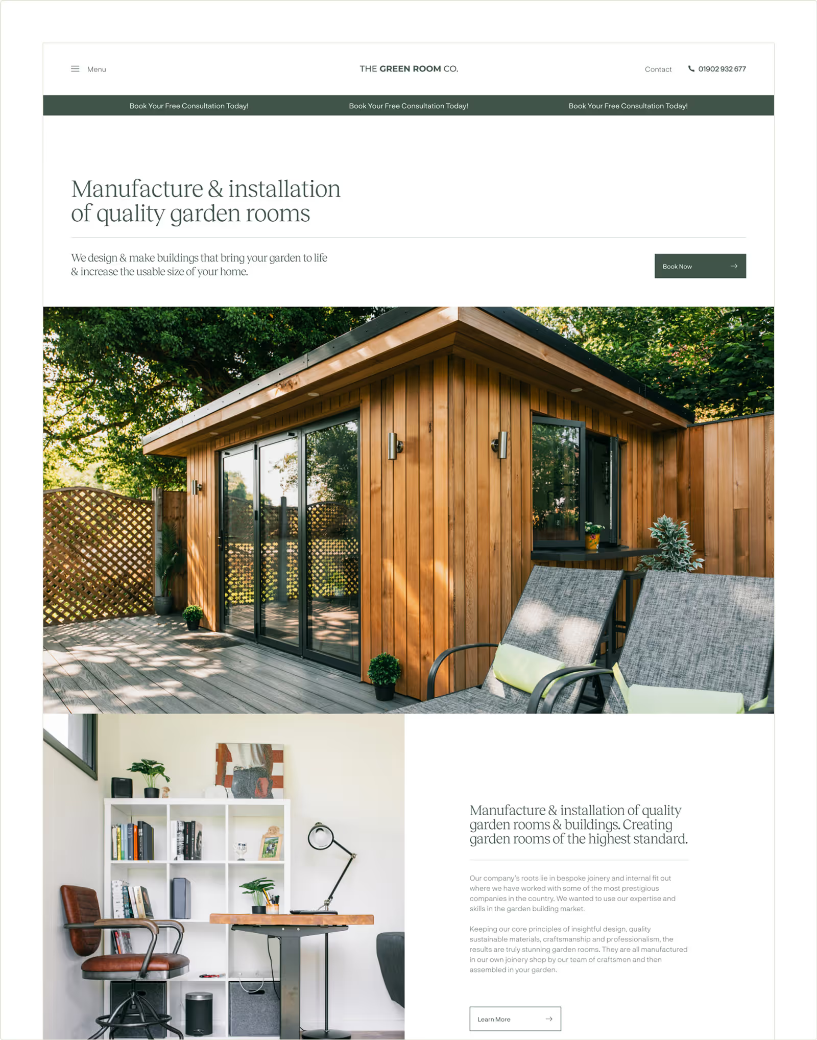
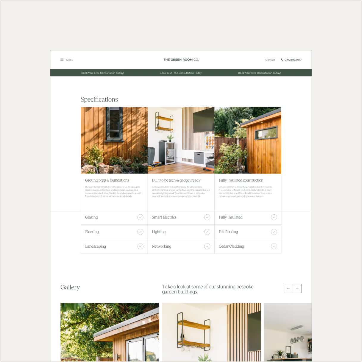
The Green Room Co. required a new website that aligned with their core principles, alongside showing off the quality & attention to detail that goes into constructing their product. We identified the importance of capturing their garden rooms in a way that could accurately convey the high-level craftsmanship & attention to detail that goes into them; something that can be easily noticed in person.
Various photoshoots were arranged on-site, capturing the exteriors and interiors of rooms of various sizes. These images were then used as a basis to build the new website around. We were mindful to construct the website in a way that allowed these images to be front-and-centre.


Our focus was on ensuring the product could speak for itself to allow it’s noticeable qualities to stand out. Our job was to provide a layout and present the necessary information to customers that could leave them feeling excited about having a garden room of their own. We carefully constructed a colour palette of light, mid and dark tones. White, Stone, Earth, Green, Mint and Grey colour groups were used to compliment the imagery.
During the research & concept development phase, we took a close look at the websites of architecture studios as well as high-end property businesses as we wanted to capture the essence of elevated & luxury living. A combination of a light colour scheme, broken up effectively using the occasional block of colour and a premium serif font for titles and headers resulted in a natural & friendly feel.


The Green Room Co. also expressed their desire to communicate & differentiate their Commercial offering. A sector of the business devoted to larger-scale fit-outs such as office or retail spaces, for this we used a slightly darker palette to give a premium feel & separate it from the main offering of garden rooms.


More Projects
[ All Projects ]Work With Us.
Ready to elevate your brand? We craft design solutions built to grow with your business. Let’s start your journey today.


